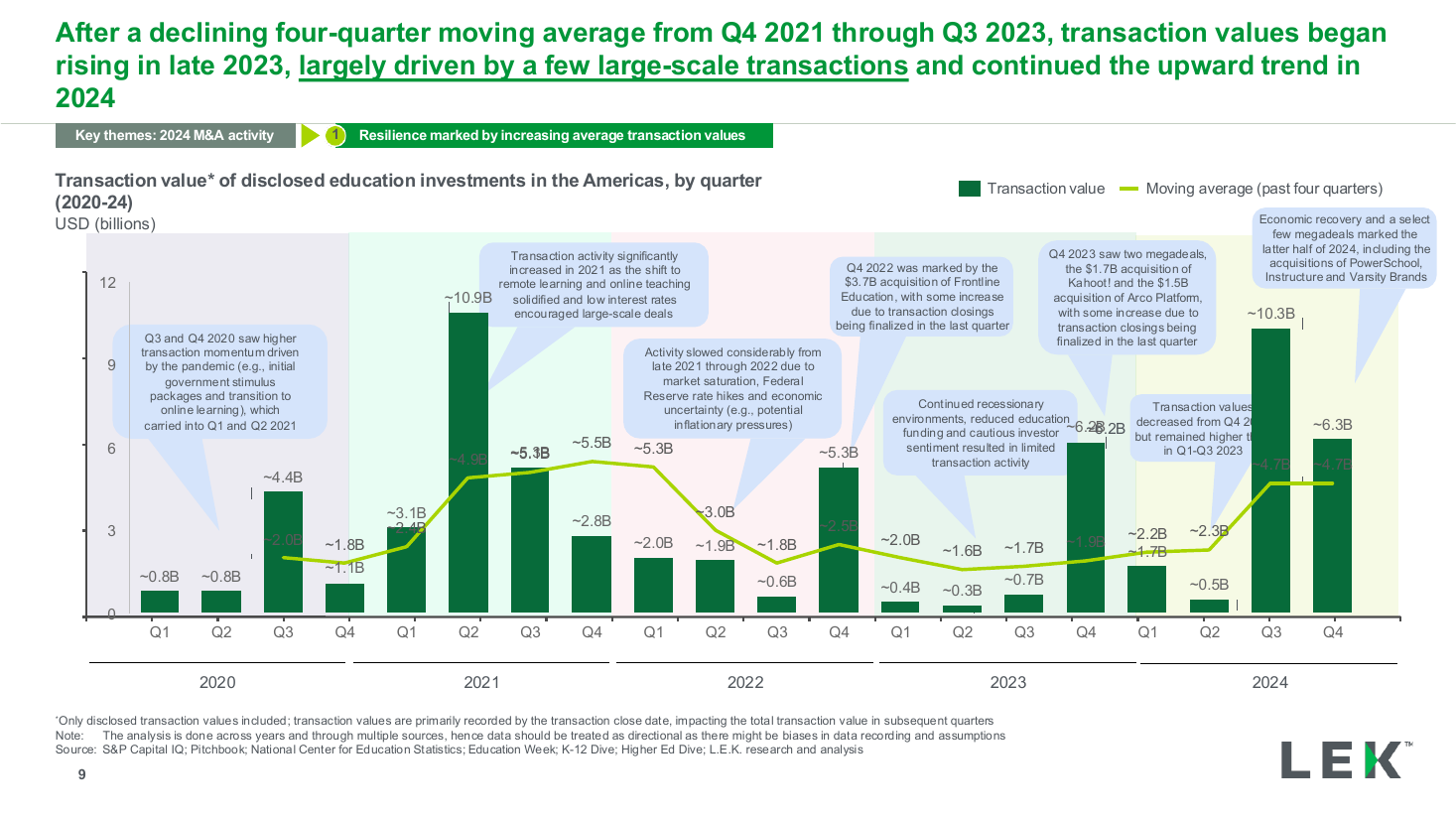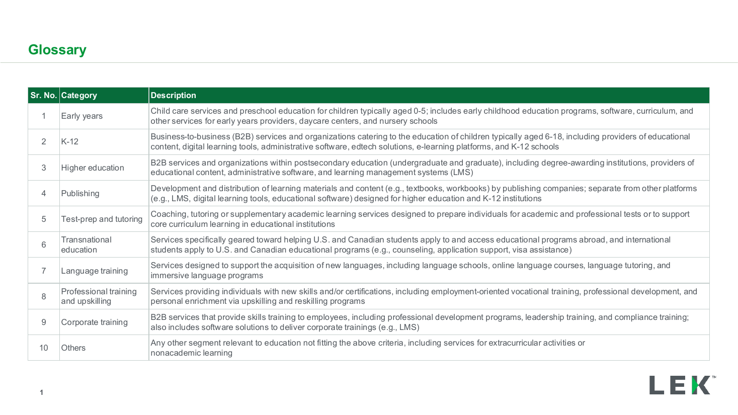
Segment glossary and category definitions table
A three-panel layout sharing six category rows: a color-key name panel, a real percentage bar chart, and a heatmap-style effectiveness panel colored on a Low-to-High scale, with a callout bubble explaining a cross-cutting insight.
Source: Recreated as a native, fully editable PowerPoint slide from page 50 of Education M&A Roundup 2024 and Trends for 2025, a publicly published L.E.K. Consulting deck. Not affiliated with or endorsed by L.E.K. Consulting.
More like this