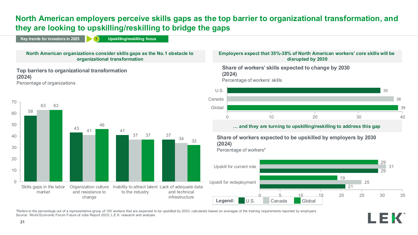
Skills gap survey three-chart panel
Three side-by-side donut charts, each with a large percentage centered in its hole and a caption above and below, comparing three related survey statistics at a glance. Use it to show adoption stages or a funnel of related metrics in one row.
Source: Recreated as a native, fully editable PowerPoint slide from page 17 of AI at Work 2025, a publicly published BCG deck. Not affiliated with or endorsed by BCG.
More like this