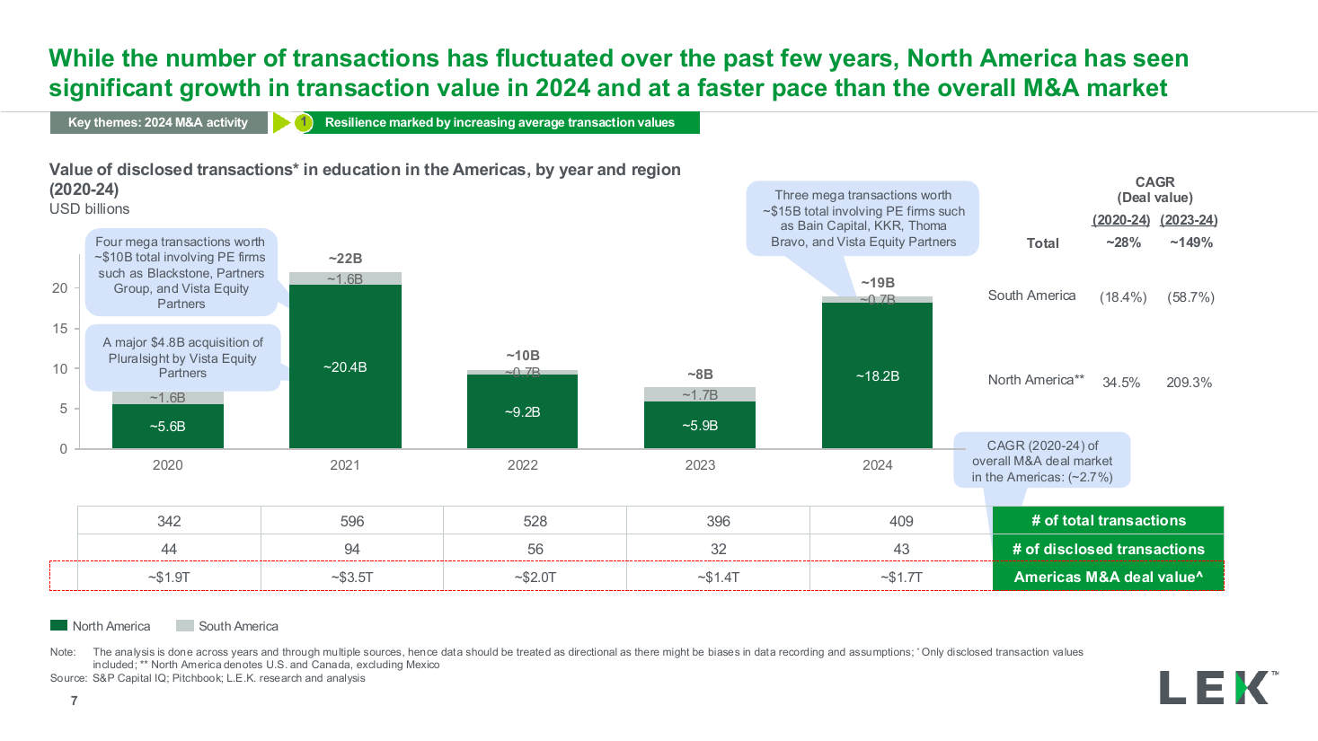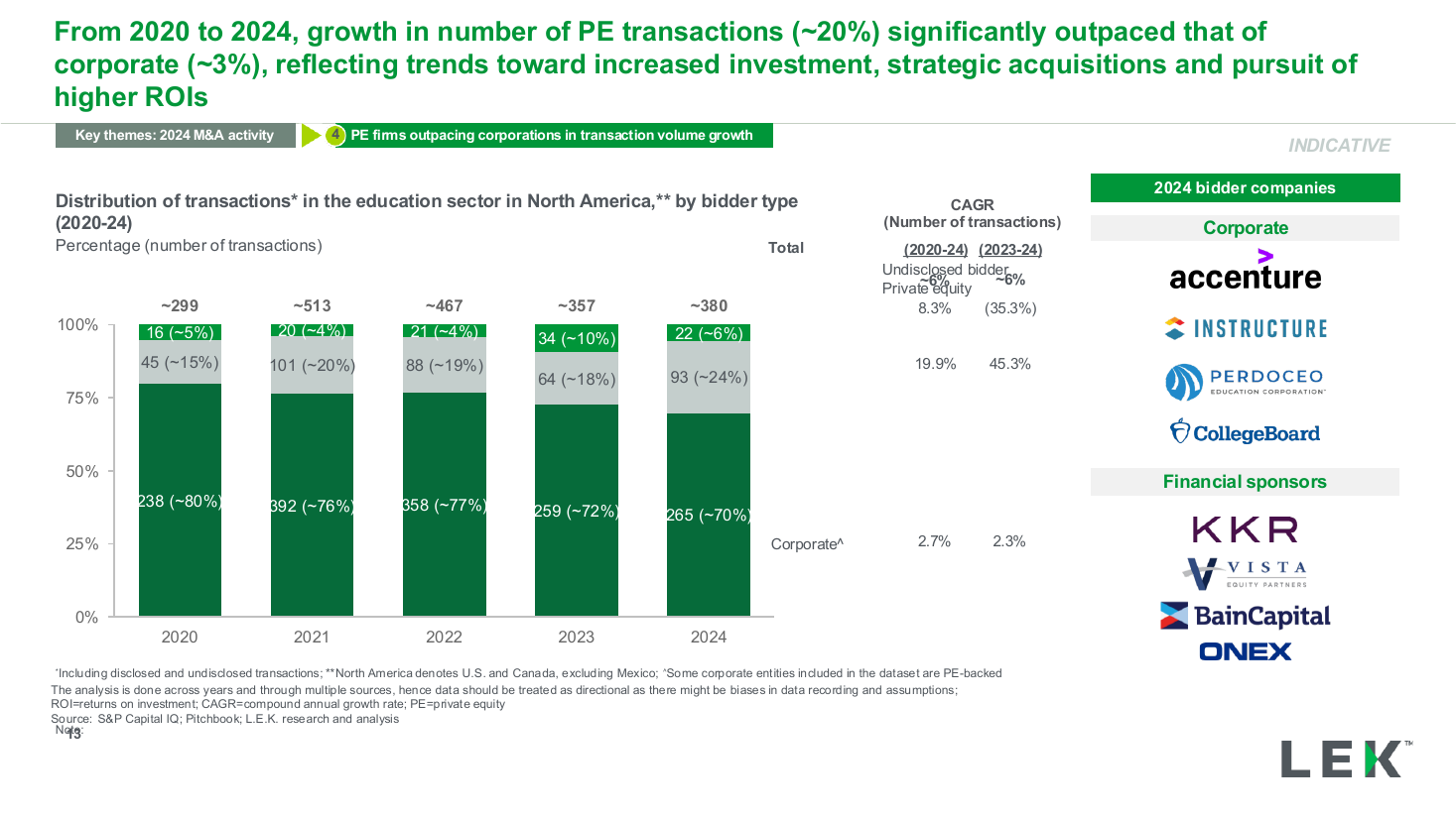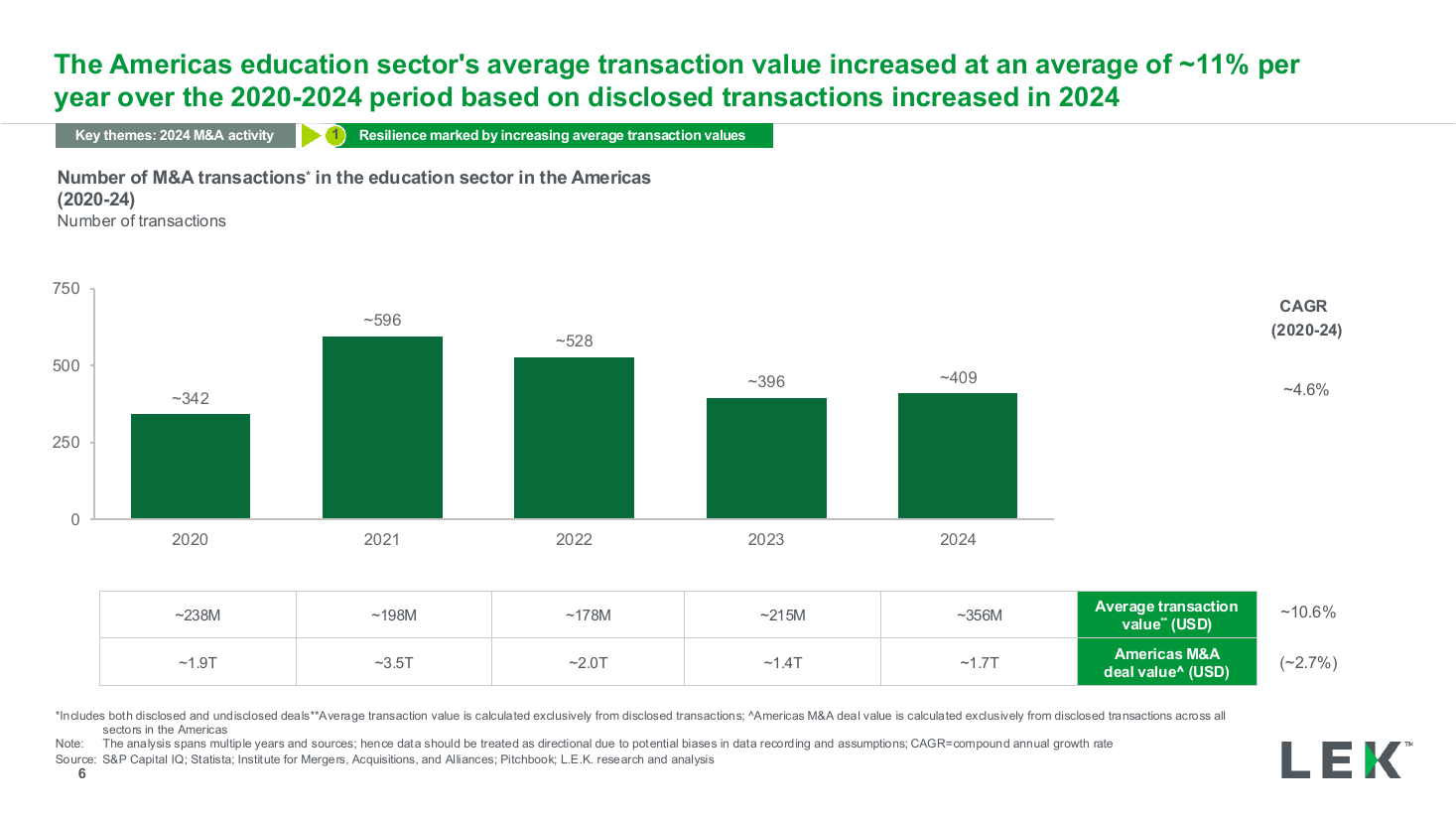
Deal volume by year column chart with CAGR
A full-width column chart ranking eight industries on a single survey metric, with a horizontal average line labelled at the right edge. Use it to show which sectors lead and lag on one measure.
Source: Recreated as a native, fully editable PowerPoint slide from page 18 of AI at Work 2025, a publicly published BCG deck. Not affiliated with or endorsed by BCG.
More like this